
You’ve almost reached the end of a challenging road: You’ve translated your offerings — a product, an app, a website, or a piece of software — and carefully crafted localized messaging for each of your target markets. Throughout the process, you’ve ensured that your design was internationalized and your content translation-friendly. There’s nothing left to do but kick back and reap the benefits of offering a stellar multilingual customer experience.
Right?
Chances are, even with a meticulous language strategy in place, you’ve overlooked something: Fonts. And you wouldn’t be the first: Many companies pour extensive effort and resources into translating their content, only to be met with a puzzling string of � and â–ˆ — symbols displayed in place of unknown Unicode characters — when attempting to reproduce it in their preferred typeface.
That’s because translation isn’t just about translating words or meanings: It’s also about the script, and not every typeface supports every language. Rendered in the wrong font, even Latin languages, such as Portuguese, Romanian, French, Italian, and Spanish, can become beset by black boxes — to say nothing of texts in Cyrillic, Thai, or Korean.
So, how can you ensure that your translation efforts won’t fall flat on their (type)face? Here are some key considerations to pick the best multilingual font from the get-go — as well as some fun facts on formatting, typesetting, and how typography can uplift or upend your branding.
Typefaces: The font of branding success
Typefaces are essential elements of a company’s branding. Just think of global giants such as Coca-Cola or Disney: It’s undeniable that their chosen fonts play a significant role in establishing their visual identity across markets.
Whether it’s a clean and modern sans-serif design, a flowing script font, or a more rounded and playful style, a font can convey a business’s tone of voice and communicate its core values to its audience simply at a glance. The right typeface will enable a company to deliver its message with clarity and stand out from the competition.
However, custom-made typefaces aren’t always a good fit for global businesses. As discovered by a multinational sportswear company, building a bespoke typeface that supports Latin and non-Latin characters while maintaining a coherent visual impact isn’t a straightforward process. Often, the most cost and time-effective solution is selecting an existing multilingual font that offers a similar look and feel.
When opting for a font with multilingual language support, it’s critical to choose one with many stylistic options (from Light to Heavy) that will cover the peculiarities of each language and allow for rich, diversified formatting.
A free font known for its flexibility and consistency is Google Noto. Noto is a universal typeface, available for personal and commercial use, that was developed by Google in partnership with Monotype and Adobe with the goal of covering the typographic representation of all existing written languages — but there are alternative translation-friendly fonts that encompass a wide range of glyphs.
Tailored typesetting
Along with fonts, another essential ingredient of script translation is typesetting — or arranging the text so that it will be visually appealing and easy to read. This typically involves choosing the right font size and layout, as well as making sure that the text is properly aligned and spaced.
Once again, adding multiple languages to the mix brings a new set of challenges, as each language can look vastly different on the page. Korean, for example, can be written both horizontally and vertically (as can Japanese and Chinese), and it doesn’t have uppercase or lowercase characters. Japanese and Thai have no spacing between words, whereas French requires spacing before some (but not all) punctuation marks, such as colons and semicolons. Line breaks are also not univocal: In Polish, single-letter words cannot be placed at the end of a line of text.
On top of that, text can expand and contract depending on which language it’s written in: Translations into Romance languages are generally up to 30% longer than an English source text, while German and Russian can go up in length by 40%. Languages such as Chinese, on the other hand, are often shorter, as individual characters can contain complex expressions — Chinese itself can take up to 20% less space on the page. This can create unwanted white spaces or crowding, so it needs to be taken into account early in the design process.
A final key aspect to consider is writing direction: Unlike Latin languages, languages such as Arabic and Hebrew are written right-to-left, which can further complicate the typesetting process.
Formatting features for a flawless finish
Bold, italics, and underlining are staples of most texts written in the Latin alphabet. They’re used for emphasis, to convey tone, to highlight foreign words, or to call attention to crucial bits of information in a text. But if you believe they’re universal, you could commit a serious formatting faux pas.
Languages that use different writing systems often have distinct formatting features:
-
In Arabic, words can be emphasized by drawing a line over the letters.
-
In Chinese, an emphasis mark — a dot (·) — should be placed below each character. In Korean, the emphasis mark — a dot (·) or a circle (⚬) — goes above each character in horizontal texts and to the right in vertical texts. Circles (⚬) and sesame dots (ï¹…) are placed similarly in Japanese. The use of italics is uncommon, as it’s not a style that mixes well with Chinese, Korean, or Japanese characters.
-
Hebrew can adopt a slanted style, but it’s not quite italics: Rather, it’s oblique and often leaning to the left.
Knowing which text formatting features are appropriate for each language is crucial to producing polished, native-quality content.
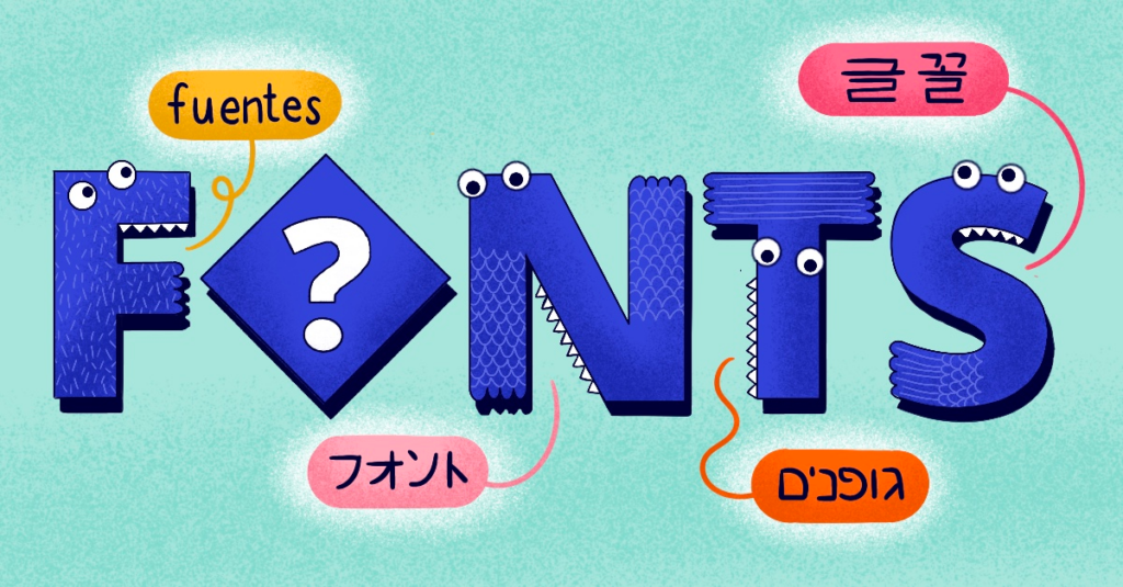
Not sure where to start looking for a typeface that will dot the i’s and cross the t’s in every language? Discover a selection of translation-friendly fonts with our latest infographic: Fantastic Fonts for Translation and Where to Find Them.